How I Published My First Novella Using Google Docs (Yes, Really)
No fancy software. No formatting panic. Just one document and a ridiculous amount of stubborn optimism.
Publishing your first book can feel like you need a PhD in layout, a subscription to Vellum, and the ability to wrangle seventeen contradictory YouTube tutorials.
I had none of that.
What I did have was a finished novella, Google Docs, and a hard cut-off for how long I’d let perfectionism delay a launch.
This post is a full walkthrough of how I formatted and published my first novella, entirely using Google Docs. No paid software. No formatting meltdown. Just solid storytelling, sensible tools, and exactly the right amount of ambition-fuelled delusion.
Let’s go.
What You Actually Need
Google Docs
A finished novella (ideally 20K–60K words)
A free Canva account
An Amazon KDP account
Time, caffeine, and the ability to not spiral over font choice
Two Publishing Paths: Digital vs Print
Before we get into it, here’s the big truth:
You do NOT use the same file for Kindle and paperback.
Different rules. Different formatting. Different exports.
So I’m breaking this into two clear sections—pick your path, or do both.
DIGITAL FORMAT (KINDLE)
For readers who like to zoom in, change fonts, and read in bed with 3% battery.
Export Format:
EPUB
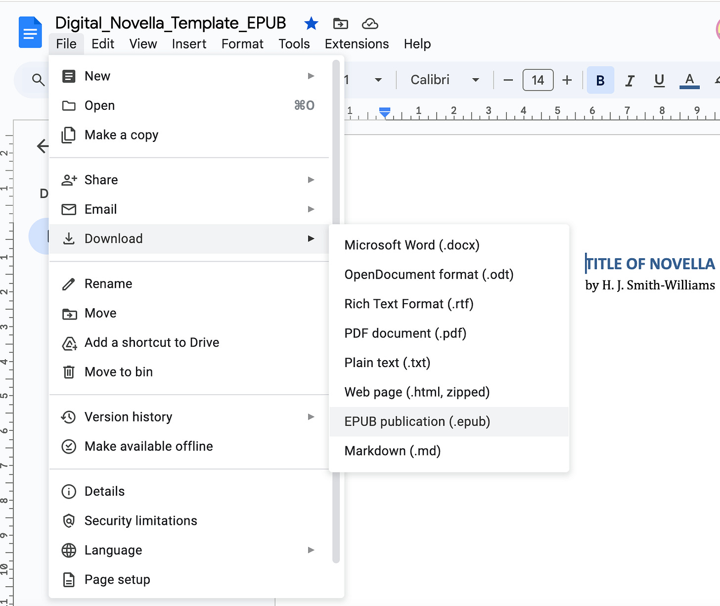
Yes, Google Docs now lets you export an .epub file directly—clean, responsive, and Kindle-approved.
Fonts for Kindle
Kindle does its own thing with fonts. So stick to safe, readable defaults.
Body text: Georgia, Garamond, or Times New Roman
Chapter titles: Arial, Georgia Bold, or Playfair Display
Size: 11–12pt body, 14–16pt chapter titles
You can bold headings, but don’t get fancy. Kindle will ignore your flourish and replace it with Amazon Sans if you push your luck.
Layout + Structure
Paragraphs: 0.3” first line indent, no extra space between
Line spacing: 1.15
Alignment:
Body = left-aligned
Titles & front matter = centred
No page numbers or headers/footers (Kindle strips them anyway)
Chapter Setup
Use Heading 1 for each chapter title
Insert a Page Break before each new chapter
Add a clickable Table of Contents via Insert > TOC > with links
Export for Kindle
File > Download > EPUB (.epub)
This is what you’ll upload to Amazon KDP for digital.
PRINT FORMAT (PAPERBACK)
For people who dog-ear pages, like the smell of paper, or still say “novella” with a soft ‘v’.
Export Format:
PDF
Print files are fixed-layout, so you’ll need a beautifully structured PDF.
Fonts for Print
Now you can indulge your serif font dreams. These will actually show up.
Body text: Garamond or Georgia (classic and elegant)
Chapter titles: Georgia Bold, Playfair, or Times New Roman Small Caps
Size: 12pt body, 16–18pt titles
Line spacing: 1.5–double (optional but adds breathing room)
Margins + Structure
Margins:
Top/bottom: 0.75”
Inner (gutter): 0.9”–1.0” to avoid swallowed text near the spine
Alignment:
Body = justified
Titles = centred
Paragraphs:
Indent first line (0.3”)
No space between paragraphs
Headers/footers:
Page numbers in footer (right-aligned odd pages, left-aligned even pages)
Optional: headers with book title/author name (this is difficult to do in Google Docs)
Chapter Setup
Each chapter begins on a new right-hand page (odd-numbered)
Use Page Breaks, not line returns
Table of Contents is static, not clickable
Export for Print
File > Download > PDF (.pdf)
Preview this carefully before uploading to KDP. Check margins, page numbers, and spacing. Then check again. Then lie down.
Cover Design (Both Formats)
Use Canva’s Kindle Cover Template (1600 x 2560px)
Keep it simple:
Title
Your name
Background colour or image
No tiny text or clutter
Download as JPG or PNG, under 50MB. This cover works for Kindle and paperback.
If you’re doing print, KDP also provides a spine calculator + full cover template if you want to go pro later.
ISBNs
You will need to purchase a set of ISBN numbers before uploading your novella. Read the full guide here ⬇️
Uploading to KDP: The Shared Steps
Log in at kdp.amazon.com
“Create new title” > eBook or Paperback
Add your details:
Title, subtitle, series info
Author name
Description (your sales pitch)
Keywords + categories
Upload:
Manuscript (.epub for digital, .pdf for print)
Cover image
Preview and check alignment
Set pricing
Publish
Avoid refreshing your sales dashboard every 3 minutes (optional, but recommended)
Final Touches (That Make You Look Like a Professional)
Front Matter:
Title page (big and bold)
Copyright page (swipe version included in template)
Dedication (optional, but always a bit mysterious)
TOC (dynamic for digital, static for print)
Back Matter:
About the Author
“Also by” section
Teaser for your next story or Substack CTA
Extras for Paid Members:
Closing Thoughts
You don’t need premium software to publish something beautiful.
You need structure, decent spacing, and the willpower to stop fiddling.
Use what you’ve got. Hit publish before you overthink it.
Your story deserves readers—not another six months in limbo while you try to master InDesign, or wait for querying agents to get back to you.
And if you’re still worried your book doesn’t look “professional enough”…
Let me tell you: readers care far more about how you made them feel than what font you used.
Unless it’s Comic Sans. Don’t use Comic Sans. Not even in an ironic way.
Hope this has helped you. Let me know if this has given you the confidence to move forward!
Holly x


